Want more wrestling news, rumors, and results? Be sure to visit PWInsider.com and PWInsiderXtra.com.

The invitation is the first thing guests see, and it quietly tells them what kind of day to expect: relaxed or formal, playful or elegant, small or huge. Making one that feels personal usually means hiring a designer or spending an evening wrestling with templates. An AI photo generator like Dreamina offers a quicker route. You describe the look you're imagining, and it returns artwork you can build your card around. In this guide, you'll learn how to gather the right details, write a prompt that fits the occasion, and polish the design until it's ready to send. Even a first draft can make people excited to say yes.
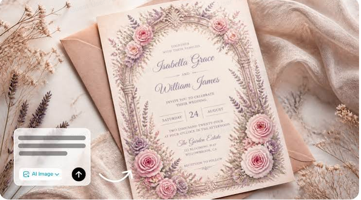
Think about the last card you kept on your fridge. Chances are it had a distinct personality: a hand-painted floral border, a bold retro pattern, or a photo-style scene that matched the theme. That personality is what makes guests feel invited rather than just informed. A personalized design also builds anticipation, which means better turnout and more excited conversation before the event. And because every occasion is different, a custom image beats a stock template that fifty other people are using.
Before you generate anything, collect what the design needs to reflect:
The occasion: wedding, birthday, baby shower, graduation, retirement
The mood: formal, cozy, whimsical, modern
The colors: two or three that match the venue or theme
The imagery: flowers, balloons, lanterns, a skyline, a landscape
The space: where the date, time, and address will go
Leaving clear space for text now saves a lot of fixing later. Jot down the guest count too, since a big party may call for a bolder design.
Invitations mix pictures and words, and Seedream 5.0 Pro has a few features that suit that blend.
Elements are separated into layers, which helps when you want to move a heading or swap a backdrop without redoing the whole design. It's a big time-saver when you change your mind about the date layout.
Multilingual support makes it practical to design invitations for families and guest lists that speak more than one language. A bilingual card feels thoughtful.
Built-in research tools on the website will help bring the latest styles into the design and add cultural references if you need some trendy looks. Just keep in mind that trends should be adjusted to your taste.
Region-level controls and 2K output keep fine details like borders and lace patterns sharp when you correct small areas. That's useful for fixing one wobbly petal.
Open Dreamina and write a detailed text prompt describing the occasion, the style, the colors, and the layout. Try this: "Watercolor wedding invitation design with gentle blush peonies and eucalyptus leaves surrounding the edges, a cream middle section open for writing, gold line details, romantic yet light design atmosphere, vertical invite layout, slight paper texture, elegant and simple." Keep the center clear, since that's where your words will sit.
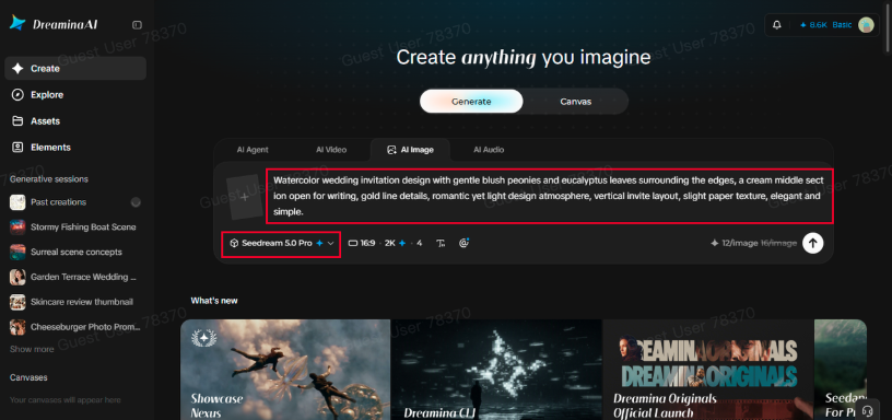
Pick your model, choose an aspect ratio (vertical works for printed cards, square suits social posts), set the size, and choose 1K or 2K resolution. Then click Dreamina's icon to generate. Use 2K if you plan to print, since extra resolution keeps edges clean. Generate two or three versions and pick the one that feels most like your event.
Use Dreamina's AI customization options to finish the design. Inpaint adjusts a small area, expand makes room for more text, remove clears distracting details, and retouch smooths flaws. When it looks right, click the Download icon to save the file. If you change the date or venue later, you only need to edit the text in your editor.
Match the artwork to the event. Weddings would be good for using soft flowers, gold and white space. Birthdays may include more vivid colors, balloons, and funny patterns. Pastel colors and illustrations work well at baby showers. Clean lines and school colors suit graduation ceremonies. Retirement parties can be warm and nostalgic, or sleek and modern. If you're unsure, look at the venue and the guests, and design for the person you're celebrating. A quick mood board of three reference images can help you describe the vibe.
Text is the trickiest part of any generated image, so plan for it. Keep the artwork mostly free of lettering and add your names, dates, and details in a simple editor afterward. Choose one or two readable fonts and make sure the contrast is strong enough to read at a glance. Always double-check spelling and times. A beautiful invitation with the wrong date is a very expensive typo.
Before ordering prints, test one on your home printer to check colors and margins. Screens glow, while paper is flat, so rich dark tones can look muddy on a card. Download at 2K for print and keep a smaller version for texts and email. For digital invitations, a square crop fits most messaging apps, while a tall version works well for stories. Leave a little extra space around the edges for trimming.
A thoughtful invitation turns a date on a calendar into something people look forward to. Dreamina and Seedream 5.0 Pro help you create that first impression without hiring a designer. Pick your occasion, write your prompt, and see which design feels like your event. Your guests are already curious about what's coming.
If you enjoy PWInsider.com you can check out the AD-FREE PWInsider Elite section, which features exclusive audio updates, news, our critically acclaimed podcasts, interviews and more by clicking here!